Back to Android
This past December, my Pixel 2 was glitching out and I needed to get it sent in for repairs. However, in the meantime, I needed a temp phone to use until I could get a replacement, and so I decided to try out using an iPhone again. The last iPhone I used was the iPhone 4, so I thought, hey, let me give Apple another shot. The increased security of iOS and privacy mindset of Apple was definitely a drawing feature.
However, unfortunately, after a week and a half, I decided to turn in my iPhone (within the 2 week return period!) and switch back to my beloved Pixel. There were just a few minor annoyances and first world problems that I just couldn’t get over, that forced me back to Android. Call me spoilt, but hey, if I spend 10% of my time on my phone and it’s one of my primary productivity inputs, then every little thing counts.
Default Apps
In iOS, there’s no way to change the default app to open things in. Want to send an email, you have to use the Apple Mail app (I prefer Google Inbox). Click on an address, it has to open in Apple Maps (I prefer Google Maps). Click “Search the Web” in Spotlight Search, it automatically opens in Safari (I prefer Firefox). This may seem like a pretty minor thing, but it got on my nerves after a while. I like that in Android, this is completely customizable.
Home Screen / App Drawer Separation
I really like the separation of the Home Screen and App Drawers in Android. I put a very few highly used applications and widgets (like Calendar) on my home screen, and then for most apps, I use the app drawer which is sorted alphabetically. I think this is way faster than trying to organize every single app manually and remember where each one is.
Keyboard Customizability
Starting with iOS 8 in 2014, iPhone users could finally install 3rd party keyboards. Given that this was one of my biggest gripes when I left iPhone a few years ago (swype typing is just too good), I thought that this being fixed would make it a lot easier for me to switch back. So I quickly installed SwiftKey on my new iPhone (the same keyboard I normally use on my Android).
However, then I learned about the caveat of iOS’s third party keyboard support. 3rd party keyboards can change certain functionality (like adding swype, different autocorrect, new emojis, etc), but they’re not allowed to actually change the layout of the keys. Every key has to be in the same place as it is in the default Apple keyboard.
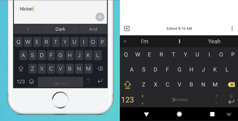
For reference, here is the iOS SwiftKey keyboard on the left, and my Android one on the right.

One thing that kept annoying me is that my force of habit, I kept hitting to the left of the spacebar in order to use a comma, but on iOS it kept opening the emojibox instead! And there was no way to fix this. But even more annoying was the number screen.

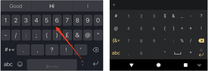
As you can see, on my Android swiftkey, I was able to put the number keys in this “phone dialer” layout which I incredibly like. It’s way faster (why else do more expensive keyboards still come with the calculator number pad on the right). However, this isn’t an option on SwiftKey on iOS. Negative point for iOS.
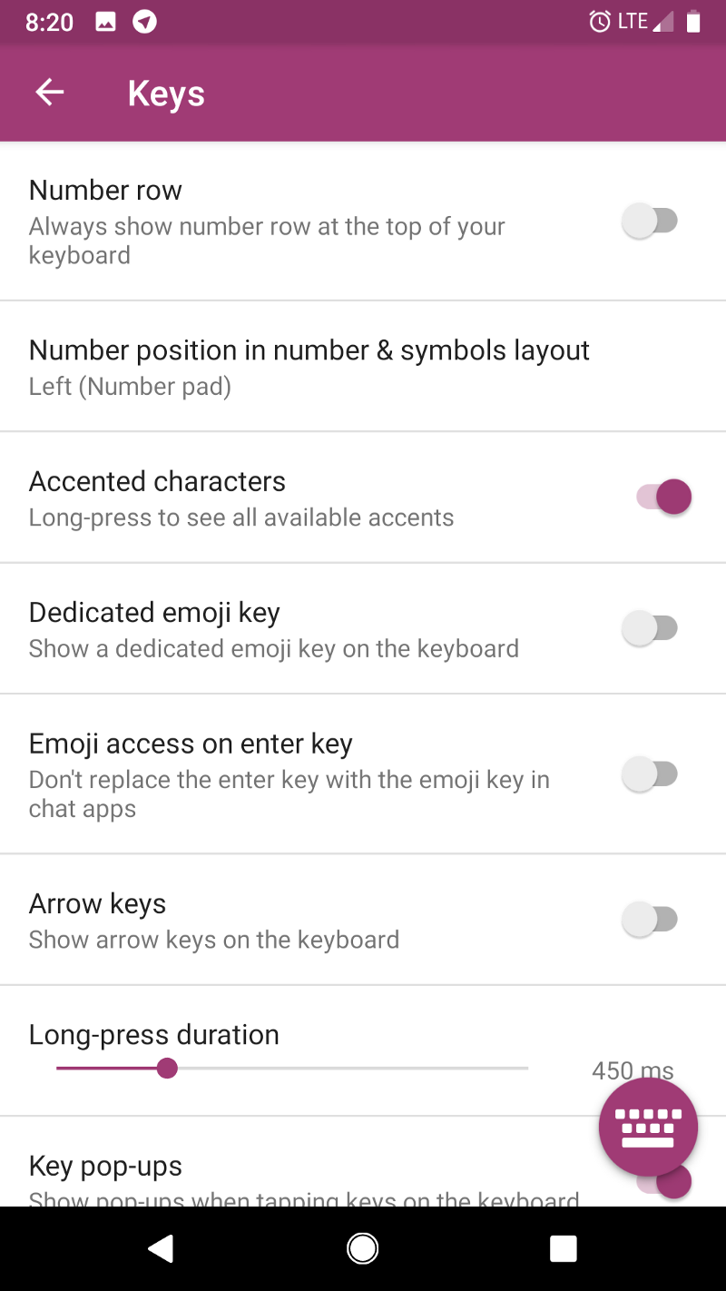
For context, here’s what part of the customization settings of SwiftKey on Android looks like.

Back Button
On Android phones, there’s a standard toolbar at the bottom (see the bottom of the above picture), which contains buttons for Home, Switch App, and Back. While iOS has swipe actions for Home and App Switch, there’s isn’t one for Back, and this is surprisingly annoying. I thought it wasn’t such a big deal, but going from a phone that had the back button to one that doesn’t, was pretty shocking. On iOS, every app would put their back button wherever they want. Sometimes it’s at the top left, sometimes its a swipe from the left side of the screen, etc. It’s nice having a standard back button that you always know where it is.
Lightning Charger
I carry around a USB C charger for my MacBook and a MicroUSB charger for other random peripheral devices. It is SO nice being able to use the same charger for both my laptop and phone; often when I’m traveling I’ll just take one charger for both. I’d hate to have to reinvest into Lightning chargers at my bed, at my desk, in my bag, etc etc.
Floating Youtube
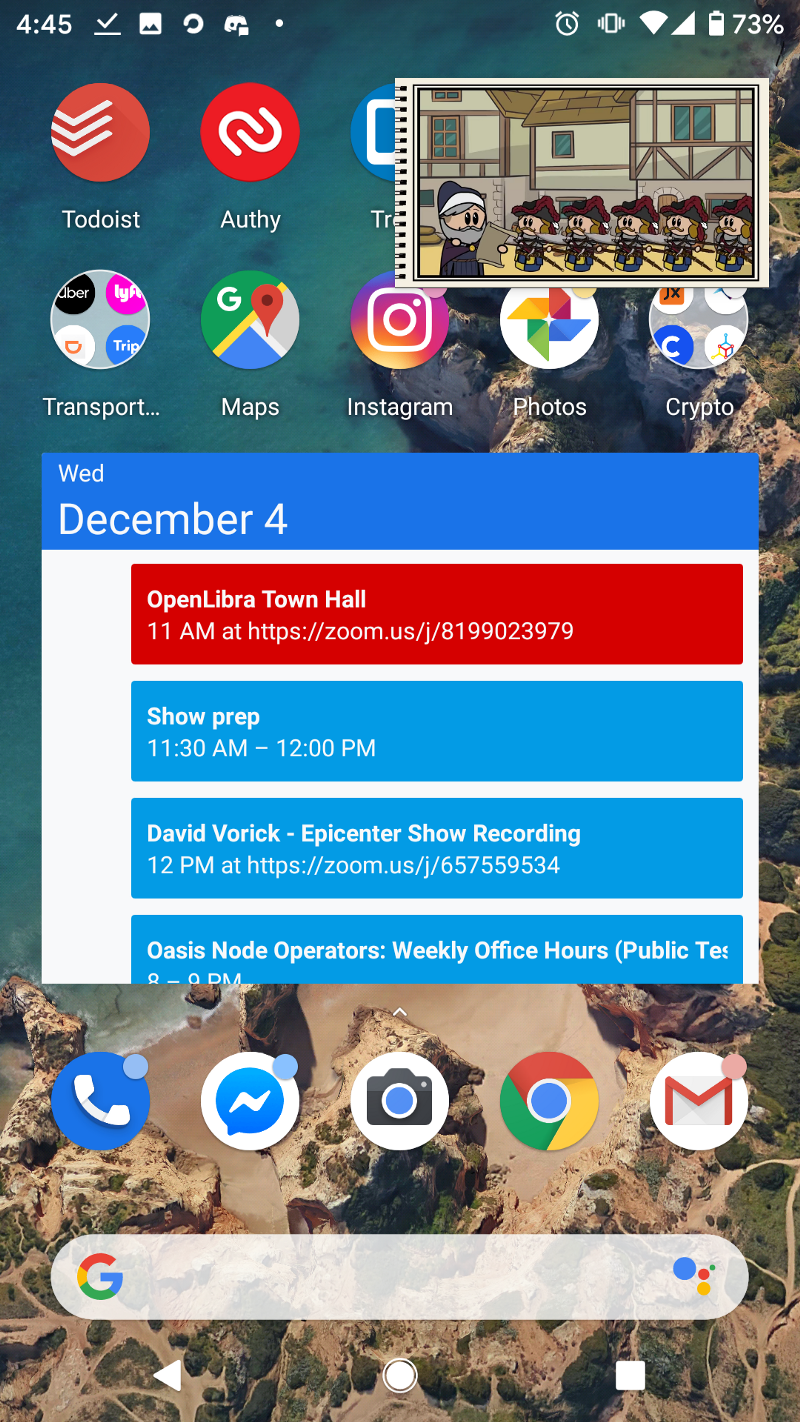
On Android, the YouTube app has a cool feature where it can pop out as a little mini window that floats above other apps. This is a really nice feature which allows me to multitask and watch some interesting youtube videos as I do things like go through my email, etc.

Widgets
On Android, you can have Widgets on your homescreen. This can be things like the calendar widget in the above picture, or even icons that do specific actions, such as create a new Trello Card or something. These are surprisingly useful and save some time for common actions.